Inch CI got a redesign
I am happy to report that Inch CI got a fresh coat of paint. For those unfamiliar: Inch CI is a service based on Inch that evaluates your project’s inline code documentation and reports grades for each class, module and method.
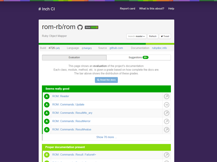
First, here’s the old design:

Although I really loved the look and feel of this first iteration (which had been online since June last year), I was always bothered by the cluttered CSS underneath and the fact that some additions, like the help section, did not really fit well into this design.
So I, by no means a born designer, set out last week to “re-imagine” the overall look and feel of Inch CI. And, thanks to Bootstrap, I was able to refresh the style of the site after about 8 hours of work.
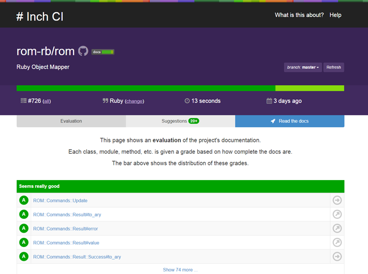
*drumroll*
I am really happy with this new look, that holds true to what made the original design great. In my book it improves both on the visual and the source code front, as the site lost about 60% of its CSS. And last but not least, this new form factor sets Inch CI up for potential extensions in the future.
Feedback on this and everything Inch-related is always welcome. Reach out via Twitter, create an issue in the project or simply email me (mail in Github profile).
